Showing posts with label framed calligraphy. Show all posts

Wednesday, 25 June 2014

Wind In The Willows

It's a while (errr… christmas!) since I completed this piece of work using words from the 'Wind in the Willows' song from the tv series based on the book by Kenneth Grahame 


Here are the words if you'd like to listen along while you read!


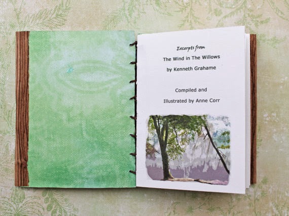
It tickled my sense of synchronicity at the time to find this artists book made by Ann Corr
in her shop, Modestly, on etsy> here. The book is sold, but you can still flick through the pictures…


She told me, 
"I did mean to do a longer blog post about it, since Kenneth Grahame was an interesting figure, and his now well loved tale was an evocation of an England that was more imagined than felt. He was a figure that longed for the romanticism of the wild, but was stuck to the comforts of suburban life." 

Ann blogs at "Moving in Time" and if you enjoy poetry, literature, bookbinding etc, 
it's a lovely, gentle place to wander.


The words are gentle too; the colours needed to be teal & purple, but otherwise I could do as I liked, so I just blended them in a dreamy watercolour wash. I often cover the mount of framed work so that it gives a softer contrast, but this one was longer than a full sheet of paper. It would have worked without, but I thought the addition of lettering strips around the edges just softened it a little, as well as repeating some of my favourite phrases from the song.


[Actually, it was to cover a mark where I mis-cut the mount...
then I added more to make it look like I meant it, but don't tell anyone will you!]


Wednesday, 23 October 2013

Minor Miracles can happen!


 DB had a plan to have his wedding vows written out for his 1st wedding anniversary gift to his wife... but with one thing and another.... you can guess the story.... I got an email on a thursday afternoon wondering whether I could get something to him by Saturday!


He'd already realised that he was probably asking too much, but whilst looking through my shop he had fallen in love with this piece and wondered whether I could arrange framing for 'as soon as possible'.

Grow old along with me, the best is yet to be.
~Robert Browning~


Well, at the moment I don't have anyone I use as a regular framer, so rashly promised I'd see what I could buy 'off the shelf' locally, if he was prepared for me to change the design to suit. In the end, I pulled off a "minor miracle" as he called it, by getting this done & posted on Friday... then Royal Mail responded to our fervent positive thinking requests for it to arrive on the Saturday!

I can't always complete work at such short notice, but if I can, I will. A good sob story & lovely attitude helps too!


Saturday, 10 November 2012

What a difference a frame makes...

I went to collect a framed piece of work for a customer recently, only to discover it wasn't what I had asked for. It looked ok, but was not something I would choose.... it might fit a certain style of decor, but it was just too heavy for the piece.  Besides which, I wanted to cover the mount & the proportions were just wrong for me.


I know the paper looks a different shade, but this is the same piece in the frame I wanted.... much more suitable for a modern home with a natural look. Picture framers tend to leave a similar amount of space all around, but when the text forms a long, narrow block, I want to preserve that shape. To do so, there needs to be more space left at the sides, with the top & bottom much closer to the mount than expected.... in this way the mounted piece is still long & narrow. The top pic is veering much more towards square.


The colour of the mount (or matt in the US) makes such a difference too & can limit the frame choice. I often use walnut ink and for many people the natural choice is to go for a sepia or dark brown mount... but that doesn't necessarily suit many frames. I much prefer to cover it with the same paper that I have written on.


People often don't know what I mean when I say that a covered mount would be an idea & find it hard to visualise. As well as complimenting the calligraphy, it suits a wider range of frames.


Saturday, 23 June 2012

Grow Old ~ Mounted & Framed

By now, the "Grow Old" embossing will have been received by the happy couple! It's really hard to photograph behind glass.... when the lettering showed up well, the glass was full of reflections on the photo. 

Anyway, this is what it looked like; you can see the overall effect of the banana backing paper & mount with the wood frame... it's very natural. Even in 'real life' the effect of embossing relies on the light... the 'barely there' look draws you in to look closer.... subtle... 


 The paper used for backing & to cover the mount is cotton rag with banana, made by Khadi. I often cover the mount with the same paper that I have used.... I feel that a regular mount is often too 'hard', especially against a handmade paper and I never find just the right white or black to suit various white or black papers.


I have done another with the mount covered in the same white paper, in this case Arches watercolour... it give a streamlined look, nice & clean... minimalist...


An alternate mount with sanwaa tissue over the white: This keeps the subtlety, but introduces another texture... it is so sheer & light, with flecks of real gold & silver leaf. It just adds another dimension to any paper... i use it so much!


Thursday, 17 May 2012

'Grow old...' an Embossing Re-worked

It seems that this piece of work has stood the test of time... there are reflections on the glass, but you can still see the words embossed

Grow old along with me
the very best is yet to be
~ Robert Browning ~


The beauty of embossing is that once a template is made, you can repeat the design for as long as the template lasts. A lady who had received one of these as an anniversary present managed to track me down.... 15 years later!!  


The trouble is I no longer had the template.... i do remember thinking that it was getting a bit tatty & if i ever did it again, i should re-do it. I can only assume that it was a casualty of my clear-out when i moved everything into the caravan, probably thinking it would motivate me to create anew. Well that worked! I never thought that anyone who had seen this early version would ever request another one this far down the line & it's quite amazing that she even found me!


drawn lettering on the bottom... 
at the top, the template is flipped over & stuck down onto card, 
and the 'holes' out of letters put back in, eg from O & D

And so i set about the process of designing letters... i couldn't bear to use the same style as before... besides i write differently now... and think & feel differently. I see no point in copying an old piece of work.... however similar this may become, i need to approach it as a new piece. It's quite a lengthy process.... i drew these letterforms, building them up so the 'thins' weren't too thin for embossing... then traced them down onto bristol board... and began cutting the letters out with a scalpel...


I love the cut-out-bits... they are safely tucked away now, 
ready to evolve into 'something' at some point. 

As i drew & traced & cut & stuck I took photographs thinking of giving you a full tutorial on the process & found myself wishing i had a camcorder to record the process too... so much can be better explained by actually seeing... I used to love teaching & i find myself hankering after it again... i don't particularly want to go back to adult-ed, besides, our lifestyle wouldn't accommodate something so fixed... anyway i had the photos & a tutorial planned in my head... then managed to delete all the step-by-step pics from my camera before they were saved on my hard drive (insert groans/cheers, depending on whether you were interested anyway!!)

a few tests on different papers

If you ever cut any amount of anything with a scalpel, wrap a plaster around your finger, or the top of the blade BEFORE it starts to hurt.... oh, & put a fresh blade in right from the start too, even if you think it's quite a new one. 


a credit to the poet 'robert browning' is lightly written in pencil
across the base of the lettering... 

I love the simplicity of white on white.... with white paper the shadows show up more & help define the letters. I added a line top & bottom to add a bit of strength & definition to the design... and the little rainbows came courtesy of the crystals hanging in my windows!

I've done two versions.... one will stay white, with a mount covered in the same paper, the other will be backed onto a natural paper & have a matching natural mount. This will be an anniversary present & will have names & date across the top, in pencil to complement the credit.... more pictures to follow when i'm done!

Wednesday, 30 June 2010

Inspired by pine trees...

Yvonne, of 'The Organic Writer' is hosting July's Festival of the Trees and asked for art submissions.... well, i did have a plan to do something new, but havn't put pen or brush to paper all month! This piece was done some years ago, but it remains one of my favourites, both for the words & aesthetically


 20 x 10 inches
NFS

I know a pine tree that leans over near a sea. At midday it bestows upon the tired body a shade measured like our life, and in the evening the wind blowing through its needles begins a curious song as though of the souls that made an end of death, just at the moment when they begin to become skin & lips again. One night I stayed awake all night under this tree. At dawn I was brand new as though I had been freshly quarried.
George Seferis - Greek poet, essayist & diplomat, winner of the Nobel Prize for Literature 1963


Both the background & the lettering is done in watercolour on Saunders Waterford Not, 190gsm. I used Brause nibs for this... not my favourites, but they were new & I had to give them a go! Brause nibs are less flexible than Mitchell's, which is useful if you prefer to press quite firmly as you write, or on paper that is too textured for the Mitchell nibs.


The various shades were used randomly in the lettering, to echo the varying colours seen in nature.


I had tested brush strokes on a separate piece of paper before doing the 'pine' & I couldn't let the resulting texture go to waste! So... thinking of a pine wood & imagining the feeling, I wrote random words & phrases across the strip of brush-marks to make a work-shop sampler. In the past I have taught workshops aimed at trying out an array of papers that aren't necessarily deemed 'suitable' for calligraphy.


I therefore used a range of pens & pencils in a variety of styles to show how they worked with this paper, at the same time trying to keep the whole thing harmonious & feeling of pine forests. Notes about what I used are jotted along the bottom. 


 This process of using gestural marks to evoke a feeling or a sense of nature, then generating the words to suit, is one that I frequently use. A few folds later and some handmade paper, gives a little booklet that serves as a record... much more likely to be kept & looked at than 'another' scrap of paper on the pile (ok, make that several piles) that I can't bear to throw away!


This simple paper scrap also led on to workshops encouraging creativity for calligraphers, but using nature as inspiration can work for everyone. I don't teach the 'try out papers' workshops anymore... I sold my paper stock to Tina of paperinc.co.uk & I think she does, if any uk calligraphy groups are interested (plus, she has some lovely papers suitable for calligraphy for sale!)


Sunday, 18 October 2009

Apache Wedding Blessing

Two versions of 'The Bidding'- an Apache Blessing (click on the pictures to see the detail). This is a popular wedding reading, and what better way to preserve the memory than to have it written out & framed!
The paper used is hand-made... both for the calligraphy, the decoration at the bottom & to cover the mount. Combined with a wood frame, the overall effect is natural & harmonious... something I feel the words deserve (you can of course choose any colour scheme you like!). The added bonus is that it suits most interior styles, which is useful if someone is unsure where the recipients will be hanging their gift.
Related Posts Plugin for WordPress, Blogger...