Showing posts with label love. Show all posts

Saturday, 9 November 2013

Red & Black Canvasses... & photography dramas

It started out with a request to add a few words to a print... here. The words "If love is a labor, I'll slave 'til the end" are from a song called 'Swing Life Away' by Rise Against


I suggested a small canvas instead, that could be done in colours to suit the song & the couple. Where price is an issue, any extra cost is offset by having no need to purchase a frame. N very helpfully told me some details about the young couple soon to wed.... including that they both have a lot of body art in black & red plus their wedding list expressed a penchant for reds. She agreed that a canvas would more likely suit a young, modern couple. When she received the canvas, N couldn't wait for the wedding & sent it off straight away!


I did a few others in the same colours while I was working, but wasn't at all happy with any of the photographs... i tried inside, outside, natural light... they either appeared washed out or too orange-y & didn't show the dark, old-school tattoo style red to good effect at all.


I just had another go at photographing them. I know that digital cameras tend to 'average-out' the colours that they see, but adjusting the white balance didn't help. Neither did adjusting the colour sliders when editing (I only have quite basic photo processing tools & skills!)


Thinking about colour 'averaging'... a light background was much better, then I thought about colour theory & went for the opposite colour on the colour wheel to red.... green, the complimentary colour... 


Much better! Also, adjusting the proportions of white, black & grey in the setting made a big difference


Although I love outdoor photography, I've never particularly enjoyed photographing my work. Once I started thinking about mixing colours in the viewfinder, much like on a paint palette, I started having more fun & more success. Having temporary access to a big wall with plenty of light from both sides certainly helps too... I'm going to dig out some more canvasses to re-photograph now!


Friday, 18 October 2013

First Wedding Anniversary ~ Paper

The First Wedding Anniversary is widely associated with paper... making calligraphy on paper an ideal gift!! And even more special when the words are your wedding vows. Nowadays more & more  people write their own vows, which is so personal.... and having them written out, to frame, is something to cherish.


 just testing...

The Bride had worn turquoise, but there was no turquoise in their bedroom, where there were to hang... lots of silver & grey though! We went for pencil lettering...

the first subtle layer of watercolour...

Pencil & watercolour look great together, and the beauty of watercolour is, 
it can be really pale & subtle...

 adding colours...

 or, by building up layers, the colour can become quite strong...

several layers to create depth...


 differing amounts of words, planned to take up the 
same space, to suit matching frames...

this couple wrote quite different styles of  wedding vows, but both full of love...


and now they have a constant reminder of the pledge they made to each other.
As time goes on, I think it's quite a good idea to remember promises made
on such a special day!

Friday, 31 May 2013

Personalised Engagement Photo Canvas with Calligraphy

My daughter wanted a canvas for her friend's engagement... something to do with New York as they got engaged on holiday there.... a love quote.... neutral colours.... a splashy heart?... or maybe something with words repeated in the background... new york, love, forever, etc...? As I looked at  photographs of New York scenes & skylines, I thought of "borrowing" some of their holiday photos ... black & white... printed on canvas & collaged onto a canvas that I could write a quote on... still with words in the background.... or maybe not... keep the background white... mmm, maybe red writing...

So the conversation went, & as usual I couldn't explain what was in my head or how to work in K's ideas... & she just wasn't sure how what I suggested would look. To be honest, I didn't really know myself at that point.


As soon as I started I went for a grey background... with darker streaks & wisps of white. K hadn't been sure about frayed edges to the photos so I trimmed them straight & 'scattered' them across an 8 x 19.5 inches ( 20 x 50cm). I do like the longer, narrower dimensions & loved this layout, but wasn't sure about the red lettering even before I wrote. It's ok.... but I wanted white...


I'd already painted a few canvasses (I rarely ever do just one) & had played with some photo collages previously, so the final version came together in no time.


Love does not consist of gazing at each other,
but looking forward in the same direction.

 I have pages of quotations typed out & this is the one K chose... Quite appropriate for them as they look forward to marriage & spending their lives together isn't it? The photo was printed onto canvas & I frayed the edges to soften the look... (yes, she did like them frayed when she actually saw them). The canvas is 10 x 12 inches & the image approx 6 x 4 inches.

I believe the bridge is where he proposed.... and they loved their gift!


Monday, 10 December 2012

Captain Corelli in Purple!


This was to be an anniversary scroll, using a reading from the wedding....


You can see from these two photographs how difficult it can be to match a colour from a picture. I had a photograph of a lovely bride wearing what she called 'mauve'.... which was a different tone from what I would call mauve. And so I used a variety of shades in the decoration of this piece... little pastel squares drifting over the page.... 


It is to be framed in a 12 x 12 inch frame, but we weren't sure whether the ribbon would be included inside the frame or not.... so, I left extra space at the top allowing the scroll to be trimmed from either top or bottom (or both) to fit.

If you would like to commission an original version for yourself just get in touch> suziscribbles at yahoo.co.uk, or take a look in my etsy shop where I also have some prints available> here


Saturday, 25 August 2012

One Card Leads to Another...

And so, having done a selection of blue 'friends' cards, a request came for pinky/purples. It's always just as easy to do several as to do one...  a session of writing 'pink stuff' & painting splashy backgrounds to use for decoration resulted in a mountain of pages of words & quotes. 


All are duly scanned & saved for future use in other projects, & finally a batch of cards assembled & photographed. It takes ages sticking those 'diamonds' in place & making sure they look randomly scattered!!

splashy background = technical term for splashing paint around

I often use watercolour for these, but the inktense blocks i got a while back are really vibrant colours & run together nicely with a good sloshing of water (sloshing= another technical term). For this sort of thing, there's no point being too precious over it... they're only going to be cut up or used as backgrounds for other things.

cards listed at suziscribbles.etsy.com

I love how... when they're cut up or little bits are taken out... how they look so delicate, or how individual little pieces look like miniature works of art in their own right, no matter how messy the full sheet was!

Saturday, 28 July 2012

Your Song ~

How many of us have a special song? One that means something to us or reminds of a particular time...
I've just had a request to write out the words to "their song", for a lady to give to her husband on their wedding anniversary. The full lyrics are here, but we decided to use certain more relevant verses and omit some bits that were repeated....


Listening to the song sent all sorts of different ideas through my mind & I was singing the chorus to myself for ages.... it must be one of those songs that speaks to so many people!


 As we discussed colours, S emailed me a photo of the dress she was wearing on the night she met her husband 13 years ago, wondering if I could use the turquoise. It's funny.... once I had that last piece of the jigsaw, i knew what i wanted to do... although at that point I was going to paint the little diamonds to decorate it or use pastels. As I wrote, the chorus was still going around in my head, & though we'd cut chunks of it out I added bits of chorus back in... layering the text to give some background texture and brings some visual interest in between the blocks of words...


When it came to add the decoration I actually printed the photo of the dress fabric & cut that up to create the blue & turquoise 'diamonds'. S said that the photo was a bit too blue & not 'turquoisey' enough, so i adjusted the colour a bit first before I printed, and then added some even more turquoise diamonds for good measure... i was only guessing at the actual colour, but hopefully by using several shades I got near enough! 


The scroll idea is proving a popular way to present calligraphy as a gift. It helps an unframed piece of work look something a bit more.... and the ribbon can easily be trimmed off to frame it later. Luckily, I had some turquoise tissue, & tied it with 2 shades of ribbon.... even if I didn't hit the right shade, at least it looked good to give!! The overall size was a touch under 12 x 17 inches.


Don't forget to leave a comment on my last post for chance to enter the give-away & have chance to win a print!!

Saturday, 23 June 2012

Grow Old ~ Mounted & Framed

By now, the "Grow Old" embossing will have been received by the happy couple! It's really hard to photograph behind glass.... when the lettering showed up well, the glass was full of reflections on the photo. 

Anyway, this is what it looked like; you can see the overall effect of the banana backing paper & mount with the wood frame... it's very natural. Even in 'real life' the effect of embossing relies on the light... the 'barely there' look draws you in to look closer.... subtle... 


 The paper used for backing & to cover the mount is cotton rag with banana, made by Khadi. I often cover the mount with the same paper that I have used.... I feel that a regular mount is often too 'hard', especially against a handmade paper and I never find just the right white or black to suit various white or black papers.


I have done another with the mount covered in the same white paper, in this case Arches watercolour... it give a streamlined look, nice & clean... minimalist...


An alternate mount with sanwaa tissue over the white: This keeps the subtlety, but introduces another texture... it is so sheer & light, with flecks of real gold & silver leaf. It just adds another dimension to any paper... i use it so much!


Tuesday, 29 May 2012

Captain Corelli Quote ~ Those that truly love...

So... two people have tracked me own in a fortnight... both previous customers, both wanting a piece of  work done as a wedding gift. I suppose I am not hard to find, but isn't it funny that this should happen now, so close together, when it is over 6 years since I closed up shop and when i am in the area!

On the other hand, earlier in the month, at the new moon, I set the affirmation that I am once more, serious about making more income from what i do.... so maybe not so funny after all, just proof that affirmations & intent have an effect!!


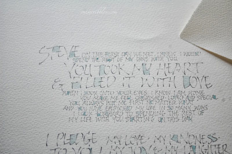
I was asked to write out a passage from Captain Corelli's Mandolin by Louis de Bernieres... this extract about what love is, has become quite a classic for wedding readings. Even though it is years since I have written it out, i found that I pretty much knew the words off by heart... quite dangerous for a calligrapher, as it is easy to write what you think you know, instead of what is actually there!


The plan was to present the gift as a scroll, which the recipient could then frame at a later date. I used a handmade cotton rag & banana paper from Khadi. This is a decent weight & looks interesting when rolled up, as well as being great to write on. I went for good old walnut ink which works so well with this paper... and being a combination of natural colours, they suit most homes. This is often a consideration when people buy for someone else... luckily i love natural!! The ribbon is threaded through slits cut at the bottom, then turned up & glued... it doesn't show at the back.

various prints & original scrolls are available
or just get in touch> suziscribbles at yahoo.co.uk

This last part would make a piece of work on it's own!  As this is the bit that carries the main message of the passage, I used different letterforms to add contrast & emphasis.... the petals across the bottom help to balance and anchor the whole thing, as well as being relevant to the words about blossom falling. The credit across the bottom, matches the couples' names & wedding date across the top.


All wrapped up with matching tissue & ribbons, it makes a pretty present! It's easy to post something like this in a postal tube.... so if you'd like a custom order for something along these lines just email me>  suziscribbles at yahoo.co.uk

overall, the approx size is 12 x 17 inches, 
this can be trimmed to fit a frame at a suitable size 
~ it will require a custom made frame ~

This is the adaptation i was given for this one... but if you look around the internet it is easy to find the original:

“Love is a temporary madness; it erupts like volcanoes and then subsides. And when it subsides you have to make a decision. You have to work out whether your roots have so entwined together that it is inconceivable that you should ever part.

 Because this is what love is. Love is not breathlessness, it is not excitement, it is not the promulgation of eternal passion. That is just being in love, which any fool can do. Love itself is what is left over when being in love has burned away, and this is both an art and a fortunate accident. 

Those that truly love have roots that grow towards each other underground, and when all the pretty blossoms have fallen from their branches, they find that they are one tree and not two.” 
Captain Corelli's Mandolin ~Louis de Bernieres

Thursday, 17 May 2012

'Grow old...' an Embossing Re-worked

It seems that this piece of work has stood the test of time... there are reflections on the glass, but you can still see the words embossed

Grow old along with me
the very best is yet to be
~ Robert Browning ~


The beauty of embossing is that once a template is made, you can repeat the design for as long as the template lasts. A lady who had received one of these as an anniversary present managed to track me down.... 15 years later!!  


The trouble is I no longer had the template.... i do remember thinking that it was getting a bit tatty & if i ever did it again, i should re-do it. I can only assume that it was a casualty of my clear-out when i moved everything into the caravan, probably thinking it would motivate me to create anew. Well that worked! I never thought that anyone who had seen this early version would ever request another one this far down the line & it's quite amazing that she even found me!


drawn lettering on the bottom... 
at the top, the template is flipped over & stuck down onto card, 
and the 'holes' out of letters put back in, eg from O & D

And so i set about the process of designing letters... i couldn't bear to use the same style as before... besides i write differently now... and think & feel differently. I see no point in copying an old piece of work.... however similar this may become, i need to approach it as a new piece. It's quite a lengthy process.... i drew these letterforms, building them up so the 'thins' weren't too thin for embossing... then traced them down onto bristol board... and began cutting the letters out with a scalpel...


I love the cut-out-bits... they are safely tucked away now, 
ready to evolve into 'something' at some point. 

As i drew & traced & cut & stuck I took photographs thinking of giving you a full tutorial on the process & found myself wishing i had a camcorder to record the process too... so much can be better explained by actually seeing... I used to love teaching & i find myself hankering after it again... i don't particularly want to go back to adult-ed, besides, our lifestyle wouldn't accommodate something so fixed... anyway i had the photos & a tutorial planned in my head... then managed to delete all the step-by-step pics from my camera before they were saved on my hard drive (insert groans/cheers, depending on whether you were interested anyway!!)

a few tests on different papers

If you ever cut any amount of anything with a scalpel, wrap a plaster around your finger, or the top of the blade BEFORE it starts to hurt.... oh, & put a fresh blade in right from the start too, even if you think it's quite a new one. 


a credit to the poet 'robert browning' is lightly written in pencil
across the base of the lettering... 

I love the simplicity of white on white.... with white paper the shadows show up more & help define the letters. I added a line top & bottom to add a bit of strength & definition to the design... and the little rainbows came courtesy of the crystals hanging in my windows!

I've done two versions.... one will stay white, with a mount covered in the same paper, the other will be backed onto a natural paper & have a matching natural mount. This will be an anniversary present & will have names & date across the top, in pencil to complement the credit.... more pictures to follow when i'm done!

Sunday, 25 December 2011

A Christmas Love Story...


Years ago a young man asked me to make a concertina card for his love at christmas... red & black & gold, with a mediaeval feel....


...he returned the following year, and the year after and the one after that.... this was when I had a shop, selling my own work & that of others....


... each year he writes his own words, telling of the love story between him & his lady.... expressing his feelings in such romantic terms....


...my shop went six years ago, but every year I still get a text or email with the next instalment for me to inscribe in an accordion book for Christmas ...


... the Proposal... the Boxing Day wedding... the anniversaries... yes Christmas time is a very special time for this Knight & his Lady...


... and I think I would be as disappointed as she, if he didn't get in touch & share a glimpse of their Christmas love story.


Thursday, 4 August 2011

Live, Love, Laugh, & doing it to death!


A request... those hearts you do.... maybe long & narrow-ish.... to go above the bed... whatever you think...

Any words on?.... no...umm, maybe.... if you like... you choose... 


So I asked for the paint used on the walls & decided a 120cm x 40cm canvas... and of course, I couldn't resist adding a few words, so suggested these... turned out quite well don't you think?!

And then, later, checking through photographs, thought I'd try a few prints....


 ... on A4 canvas, both with the "love" and without...


...and then removing colour... I LOVE the charcoal grey... 


... and then wondered what canvas for inkjet would be like to write on...
it works a treat! 
What a convenient way for folk to have personalised calligraphy 
for weddings, engagements or anniversaries!

Various combinations of print size and colour options have found their way to my shop suziscribbles on etsy. I've done some 'live, love, laugh' fridge magnets which are still to list & am thinking about cards... only thinking at the moment tho, lol! 

Talk about "having an idea & doing it to death"!! Sometimes it's quite fun just working through all the possibilities for one thing, rather than trying to conjure up 'new' ideas all the time... mind you i don't really have problems with new ideas, it's finishing off (or even starting) the ones i already have that needs some working on!  


Related Posts Plugin for WordPress, Blogger...