Showing posts with label informal styles. Show all posts

Friday, 11 July 2014

A mega accordion book- 5 feet long!

What a love story this turned out to be! A lovely lady called Lisa asked about an extra special love letter to include a marriage proposal. We decided on a concertina book with a couple of envelopes for keepsakes such as a show ticket & a pressed flower from milestone dates. Well…. the idea sort of grew… and grew.


We decided on colours early on; natural tones, charcoal & sand… layers of watercolour… more water… more colour… some acrylic...


I asked her to think about special events along the way… 
dates, places, songs etc… little things that tell their story...


She told me their tale of synchronicity & bliss, of cold feet & separation; yet always on each others mind…. until they finally re-united...


Just as their story has many strands, I wove snippets of songs alongside tender memories...


 layering their tale in a book of love… 


Extra pages stitched in, for her to write a personal letter in her own hand...


A proposal hidden at the very end...


books within books, pages to unfold...


quotes about love & words they have spoken…


 space for a ring to hide?


Wednesday, 11 June 2014

A favourite paper for a proposal scroll

If I had to choose a single paper, this Bhutanese Rhesho could be "The One". Either this or the Tsasho which is very similar except that it has the 'laid' lines from being dried on bamboo screens. There's a definite 'tooth' to the surface, which makes it beautiful to write on, and though it is textured, there aren't any annoying little strands of fibres that catch on your nib (at least very rarely!) Rhesho combined with Thai Mulberry tissue makes such a delicious, natural combination… the off-white lettering that tones with the mulberry gives such a harmonious look that I really love. 


The lettering on the outside of this scroll is done with a drafting ruling pen. You're not going to see the inside, as it contains a very personal marriage proposal! 


Ice cube trays make excellent mixing pots but white ones are actually better to show up the true colour of the paint. I'm using gouache here, and I brush it in between the tines of the ruling pen. The little screw on top adjusts the gap & thus the line width.


If you've never tried writing with one of these instruments before, you should, 
& you don't have to be a calligrapher to have a go either! 


This little scroll was to be hidden inside another...


… to be opened on a romantic re-creation of a first date.

this did get petals added, but I also really like it without


It did the trick… Tina said " I couldn't be happier with what began as a "quick enquiry". My enquiry was anything but quick but Suzi remained patient with my ever changing mind and delivered a beautifully bespoke handmade scroll which I presented to my Fiance when proposing to her. Needless to say, she said yes and was over the moon with the scroll and how personal it was to us as a couple."

That's one of the best bits…. getting to hear the happy ending!

Monday, 26 May 2014

An Arty Card for a Teenager...

… that sleeps at every opportunity!

 "I don't take naps…. I take horizontal life pauses"

I've had these backgrounds painted for a while, so when my sister made a request for this brilliant quotation, I knew exactly what I wanted to do. All I had to do was pick a colour!


Then my niece decided that they'd make perfect 'Thank you' cards for her teachers…. of course she only let me know the day before she needed them. Kids eh! 


She was right though…. they're a perfect non-conventional extra special card
that can say anything that you want them to.


I love the freedom of making gestural marks reminiscent of writing but without the need for words.


 I even used up my last piece of fuchsia coloured paper for her [you owe me H!] It's such a shame…. I'll have to order some more paper now *smile*. It was a touch bright to go with the raspberry ribbon, but sanwaa tissue over the top toned it down just enough. 


Thursday, 27 March 2014

2nd 'Cotton' Wedding Anniversary Canvas

As the second wedding anniversary is traditionally seen as 'cotton', a canvas is an appropriate present…. especially when it includes a reading from your wedding & takes inspiration from the bridal bouquet! It's not meant to be an exact representation… just something that captures the sense of it… the fresh greens, the feeling of spring in the air...


Before the 1930's, just the milestones were marked; only 5th, 10th, 25th, 50th & 70th had gift suggestions. But as in most areas of life, commercialisation led to a full list names for every year of marriage…. in 1939 the American National Jeweller Retail Association published a full list. The list has been revised over the years & different countries have slightly different versions, and of course some countries have long-standing traditions for certain anniversaries.


In the 'Holy Roman Empire' of the Middle Ages, husbands would crown their wives with a wreath of silver leaves on their 25th anniversary & with gold leaves on their 50th. The tradition of a silver & gold wreaths continued in many places, with the gradual addition of more land-mark anniversaries. Traditions have changed too… at one point the Diamond Wedding was the 75th, but since Queen Victoria's Diamond Jubilee after 60 years on the throne, diamonds became associated with the 60th wedding anniversary in the UK.

The list I have had for ages gives the 1st wedding anniversary as paper & the 2nd as cotton, which is great for me as a calligrapher… I can offer a gift made from both! But there are various versions…. the UK & US have many dates the same but a few differences, and a 'modern' version seems to have been developed alongside the 'traditional'. Take a look over here> Wedding Anniversary Gift Lists. (the 15th is crystal on all other versions i've found) I'm not sure about the modern one at all…. gold jewellery, cars, optical goods…. hmmm, the retailers are obviously still involved in compiling that…. a kiss on the cheek would be bonus from Mr Scribbles, lol.


The canvas was 'whiter' than the photo, more like the close-up above, but i can't seem to get rid of the yellowy tones. I didn't even attempt to portray different flowers, even if I had the skills I wouldn't want too many different details vying for attention… it's the words that matter here,

"Charity suffereth long, and is kind; charity envieth not; charity vaunteth not itself, is not puffed up,


Doth not behave itself unseemly, seeketh not her own, is not easily provoked, thinketh no evil;


Rejoiceth not in iniquity, but rejoiceth in the truth;


Beareth all things, believeth all things, hopeth all things, endureth all things."
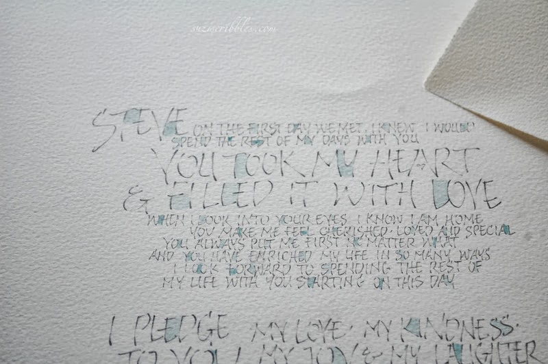
Despite the formal style of wording, I wanted this to look fresh and modern, so quite informal, brush lettering spills down the canvas…. echoing the brighter green buds of the bouquet nestled amongst the mass of white flowers. It really makes a thoughtful & romantic anniversary gift doesn't it?

I'd love to hear about your most romantic gift… or the least, lol! I can't think that I've received anything outstanding either way... sigh...

Tuesday, 10 December 2013

Brush your teeth!

Some colour is needed, I think.... I seem to have been very neutral of late.
Some lively splashes of cerise, aqua & lime.... such fun... 


Designed with a child's or teenagers room in mind...
how many times have we heard or said these words or something similar?


Brush your teeth
Hang up your coat
Wipe your feet
Clean your room
Do your homework
Turn off the light
And remember
Mum & Dad love you x

The set of 3 is available here, but you can have a version made to suit...
with any colours or with your personal most used admonishments!


overall size 100 x 40 cm ( 40.25 x 15.75 inches)
2 canvasses 30 x 40 cm (11.75 x 15.75 inches)
1 canvas  40 x 40 cm (15.75 x 15.75 inches)

I'm trying to think what I said most to my two.... probably something about stamping up the stairs & washing up would be in there... & turning off the tv if they're not watching it! I'll have to ask them & see what they remember! We'll probably remember totally different things, I know me & my mum often used to talk about the same incidents in very different ways. 
My dad was definitely one for telling us to turn lights off... 
& to get our elbows off the table was high on the list!


The last photo isn't particularly clear, but it gives an idea of how the idea can be adapted.


Saturday, 30 November 2013

Brush Lettering on Mulberry... free to a good home!

Following on from that brush stroke that felt so good in the last post, I tried some lettering with a Chinese brush onto Khadi Mulberry. I set off with the "I do not sleep", intending to create a neater sample page with various tools & mediums, but after writing the next small line I was enjoying myself & just carried on writing!


You can see the transparency of the paper from the ruler & sheet of absorbent paper underneath. The lettering is all done with the same brush... varying from laying it on it's side to using the very tip.


 On the whole, I can write pretty straight without guide lines, but right at the end I lifted up on the right of the page. I do it so often it's maddening.... especially as I'm aware that I do it & watch for it, yet it still happens unless I mark that last line in. I actually positioned the paper straight underneath to act as a guide line but still.... Thinking about it now, I'm wondering if it happens when I don't move the piece of work up as I work down the page, so rather than viewing straight on, I'm looking at my writing at a slight angle, so I "see" that I'm going straight even when I'm not. *sigh* I've been doing this on & off for years & it's only writing about it now that it seems so obvious... I'll check my writing position next time!


Even so, it is possible to rescue a piece that suffers from a drifting bottom line. Adding some form of decoration to fill the space & balance it out often saves a re-write. The heavy line would have been sufficient, but there were a couple of  mistakes I wanted to cover, so added the splash. It was a bit heavy & missed the mistake altogether, so I lifted some of the ink out with tissue... then added a few more watery splashes, lifting some out to echo the look of the first one....


I like the effect... even though some letters aren't legible, the sense of the words is there. It also conveys a sense of the words.... of spirit slipping from one world to another, here but not here...


In the previous 2 & the next pic, the tissue is hung at a window... lovely textures from front & back... floating....


Would anyone like this?

If I had somewhere to hang it, it's one I'd keep... but it does need to hang somewhere. Perhaps pinned to a board or pegged from a string line...  or maybe another strip of paper or fabric stitched across the top to give enough strength to attach to a branch or pole of some sort.... or collage it into another piece of work... add a layer of your own creativity.... could look good with a layer of something else floating behind... ??


If you want it just leave a comment....& share what you might do with it. If more than one person puts their hand up, we'll have a draw next week :-)

Thursday, 14 November 2013

Bright, Fun Hearts on Canvas

I'm enjoying having a little photo set ready & waiting to use whenever I want. There's a large unused building on the site that I've virtually taken over! We will only be here for a couple of months at most, but i'm going to take advantage!


I can do these in any colours or size.... with any words you choose....  
Or with a name on.... great for a child's or teenager's room

white hearts on lilac
5" x 5" / 15 x15 cm

These hearts are a little wild.... fun & expressive.... great to show you care. They're great fun to do, if a little unpredictable... I'm never quite sure how they will turn out, they seem to have a life of their own & they all seem to have their own unique character!

Friday, 18 October 2013

First Wedding Anniversary ~ Paper

The First Wedding Anniversary is widely associated with paper... making calligraphy on paper an ideal gift!! And even more special when the words are your wedding vows. Nowadays more & more  people write their own vows, which is so personal.... and having them written out, to frame, is something to cherish.


 just testing...

The Bride had worn turquoise, but there was no turquoise in their bedroom, where there were to hang... lots of silver & grey though! We went for pencil lettering...

the first subtle layer of watercolour...

Pencil & watercolour look great together, and the beauty of watercolour is, 
it can be really pale & subtle...

 adding colours...

 or, by building up layers, the colour can become quite strong...

several layers to create depth...


 differing amounts of words, planned to take up the 
same space, to suit matching frames...

this couple wrote quite different styles of  wedding vows, but both full of love...


and now they have a constant reminder of the pledge they made to each other.
As time goes on, I think it's quite a good idea to remember promises made
on such a special day!

Related Posts Plugin for WordPress, Blogger...